My Event Management degree recently consisted of a module titled “Consumer Culture” – a module which I enjoyed very much and have succeeded in. This module has helped me greatly with my dissertation, and has opened up my mind to the varying ways of studying Event Management. The link between Sociology and Event Management is also evident in this module. I learned many interesting things during this module last semester, but one of the lectures that stood out to me the most was on Semiotic Analysis. I would have loved to include this type of research in my dissertation, however I think I will have my hands full conducting interviews and questionnaires. After all, tomorrow it is a mere 3 months until my final dissertation has to be handed in… What a scary thought!
I thought I would share semiotic analysis on this blog as it can prove to be very eye-opening. Semiotic analysis shows that there is more to an advert than meets the eye. Below are 5 images that I have taken myself from the current “Brides” Magazine (Brides Magazine, 2014). Apologies that the quality of them is not perfect, but it is far easier to take a photo of the exact advertisement I wish to refer to rather than find them online! Each advert that I have chosen poses many questions, such as why have they chosen the person that is involved in the photo and why have they chosen that exact background? My tutor provided a fantastic example of an advert that had been designed to the very finest of details. It is easy to flick past an advert in a magazine without putting much thought into the design and message behind the advert, but semiotic analysis allows the mind to think deeply about what the designer intended the reader to come away with once the advert has been analysed. Semiotic analysis is very subjective as each individual may take something different away from an advertisement. Without speaking to the advert designer, it is hard to know exactly what they intend for us to pick out from the advertisement, but it is possible to think deeply about the possibilities.
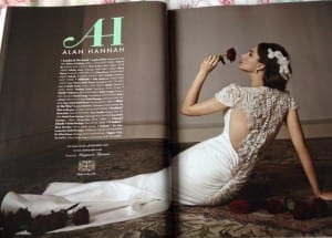
Image 1 – Alan Hannah Wedding Dress Designer

Why are there red roses present in this image? Why is the text centered in the middle of one page? Why is the bride sat on the floor? Why are the roses placed as they are? What does the advert designer want us to take away from this image? Personally, I believe the answer is romance, as is the answer with many wedding dress adverts. The presence of the red rose brings our attention to romance as it is the symbol of love. The attention to detail is synonymous with the relationship between the bride and the red rose she is holding.
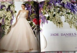
Image 2 – Jade Daniels Wedding Dress Collection – designed by Christine Dando

What is the theme behind this advert? It appears to be for younger brides when compared to the advert above. What is the symbolism behind the flowers and the scenery? Is the bicycle of symbolic importance in this advert? Why is a bicycle important in a wedding dress collection advert? What element of the advert has most attention paid to it? Why has the advert designer chosen these certain types and colours of flowers? My interpretation of this advert is to take the reader back to their childhood fantasies. As I have mentioned in my literature review posts, children are socialised into believing in marriage and the white wedding. It is common for children to ride a bike and enjoy colourful and pretty scenery such as the one in this advertisement. I believe this advert is telling the reader that their dream wedding dress can be found with this particular designer.
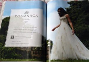
Image 3 – Romantica Bridal Gowns Collection

Why is the bride looking down? Why is the angle of the photograph looking up at the bride rather than on the same level with her? Why has the designer chosen to photograph the advertisement outside? Why is so much of the advert taken up by the information box? What is the bride doing in the photograph? Why does this advert include more textual information than others? I believe the angle of the photograph is to demonstrate the idea of “looking up” to the bride as the wedding day is traditionally about the bride. The collection name “Romantica” is displayed in the advert on an outdoor background as outdoor wedding photographs are thought to be romantic.
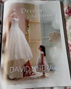
Image 4 – David Tutera Wedding Dress Designer

This advert is self-explanatory, and is my favourite advert in this issue of Brides Magazine. Once again, the concept of a little girl experiencing the day she has been dreaming about for her whole life is captured in this heart-warming image. The simplicity of the horse figurine, the flowers on the ground and the teddy that is being held by the girl gives the image an aura of innocence – an aura that is associated with brides and white weddings.
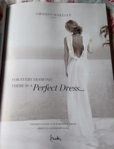
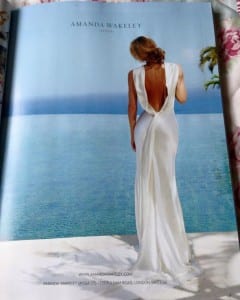
Image(s) 5 – Amanda Wakeley Wedding Dress Designer


The above images demonstrate the difference of black and white, and colour images. Which one will stand out more to the reader? These images are found on pages 63 and 65 of Brides Magazine (Brides Magazine, 2014) so the reader views the black and white image before the colour image. The images are easy to compare because of how they are featured in the magazine. Many advertisements in this Brides issue feature holiday destinations as the background – most likely as a hot destination is very appealing to most brides and is associated with the wedding day due to the organisation of the honeymoon. These particular adverts also display the difference that an extra piece of text can make. For example, the first thing your eyes avert to on the black and white image are the words “perfect dress”, however in the colour advert you gaze upon the bride and the background first.
As demonstrated through these 5 images, semiotic analysis allows the mind to wonder deeply into the workings of an advert. It is easy to pull the advertisement apart to discover what is most important about it, and what we are supposed to take away from it. These analyses have been very brief, and there are many more examples found of ideal adverts to analyse in Brides Magazine.
References:
Brides Magazine (2014) Brides (January/February 2015, Diamond edition).
